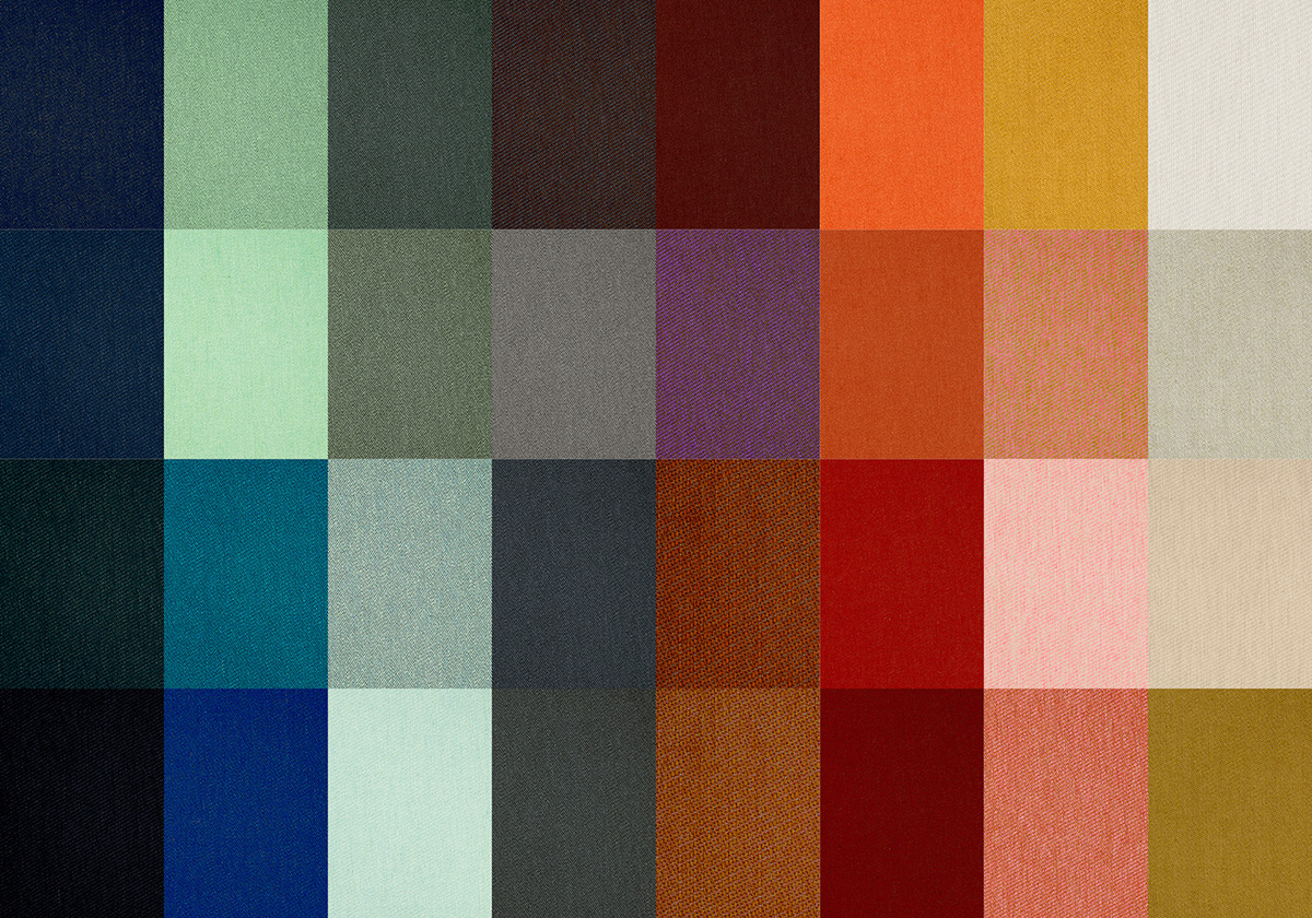
In collaboration with the Danish weaver, Kjellerup Væveri (Kjellerup Weavers), House of Finn Juhl has created a collection of textiles, comprised of 32 colours in wool and cotton. The collection takes its point of departure in the original watercolours by Finn Juhl and is designed by textile designer Lykke Bloch Kjær. The textiles are woven at Kjellerup Væveri in Denmark and will be unveiled at the House of Finn Juhl showroom during 3 Days of Design in Copenhagen from September 16th-18th.
It has been a longstanding wish at House of Finn Juhl, to develop a collection of textiles for upholstery where quality, craftsmanship and design are adapted to Finn Juhl’s organic expression and colourful history. House of Finn Juhl presented the idea to the distinguished and traditional weavers Kjellerup Væveri and this became the first step towards a design collaboration.
Lykke Bloch Kjær, who holds a degree in textile design and teaches at The Royal Academy of Architecture, Design and Preservation, has been leading the effort of bringing the collection to life through dialogue with the founders of House of Finn Juhl, Hans Henrik Sørensen and Ivan Hansen.
The Light, the Heavy, the Colourful and the Delicate
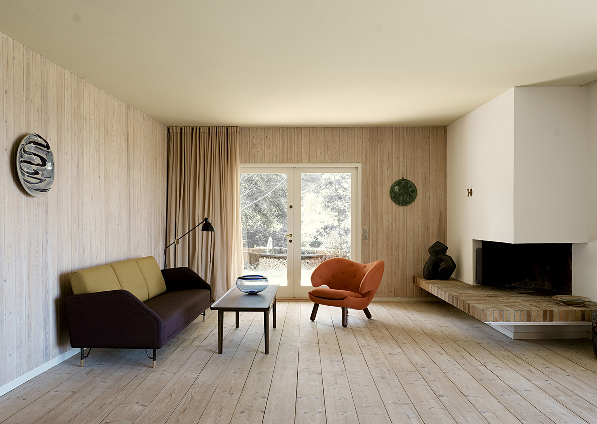
Throughout his career Finn Juhl would study and follow the processes very carefully, whenever his designs were upholstered in colourful textiles. By doing so he ensured that the final product corresponded with the watercolours which he had his trusted employee, Marianne Riis Carstensen, carefully colour. It has been vital to House of Finn Juhl, that the collection is based on the original watercolour drawings and that it is produced with respect for the textile profession.
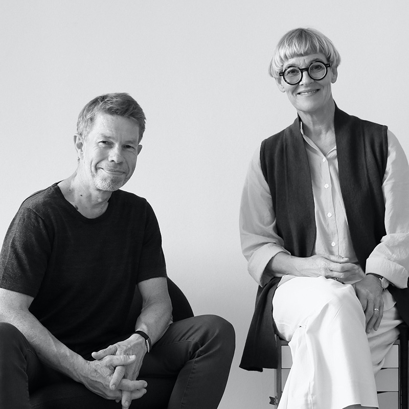 Designer Lykke Bloch Kjær has the following to say about the collaboration:
“Once you start appreciating each other’s profession, something entirely new arises – something very special. Traditionally speaking, textiles have been sort of an “add-on” to furniture – the finishing touch. As a textile designer, it has been imperative to design something that caters to a broad audience, but you are often alone in designing it. In this collaboration, two perceptions are at play. Those two perceptions have formed the foundation for the development of something quite unique. This collection represents the conversation that sprung from the interplay between the two professions – furniture and textile design.”
An In-Depth Study of Colours
Finn Juhl’s drawings have been studied carefully throughout the years at House of Finn Juhl. The great body of work, which is housed at the Danish Design Museum, consists of a large collection of watercolour drawings which depicts furniture, exhibitions and interiors. The drawings are pieces of art in their own right, but they also offer special insight into the way that Finn Juhl understood and employed colours throughout his career.
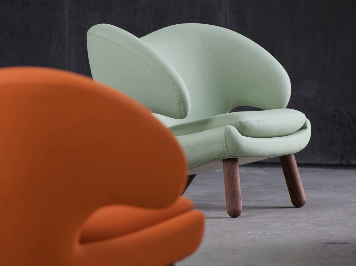
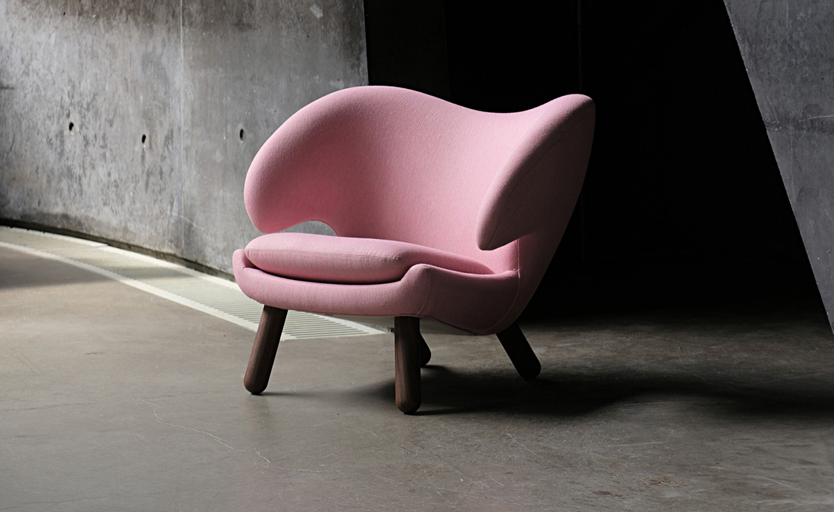
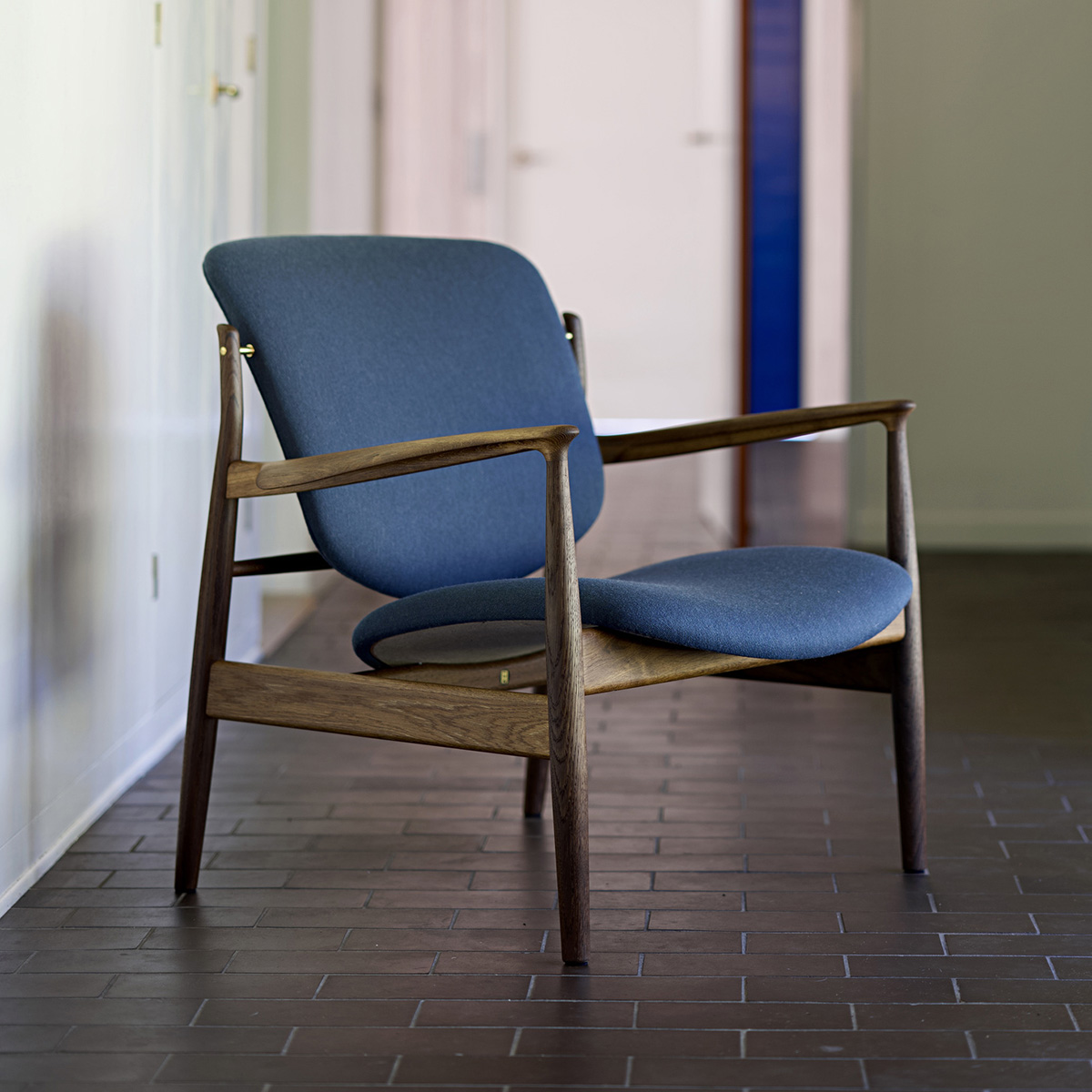
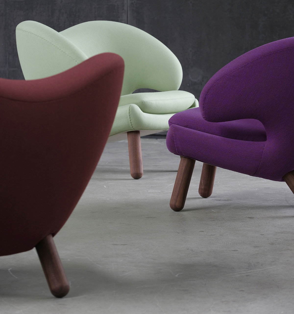
Based on these watercolours, Lykke Bloch Kjær describes how the collection spans colours with a low degree of contrast, as well as colours with an extremely large degree of contrast. When taking in Finn Juhl’s watercolours, it becomes readily apparent that on the one hand they are extremely light, while on the other being very deep in terms of colour saturation and nuances. House of Finn Juhl and Kjellerup Væveri have worked hard to incorporate this characteristic into the collection of textiles. The width of the collection ranges from the very colourful to the entirely neutral nuances, that mimic natural materials. It is this range, that Finn Juhl himself employed in his work, when presenting his upholstered pieces of furniture. The textiles and colours of each piece were carefully selected to become part of the story that was being told.
As part of this process, Ivan Hansen and Hans Henrik Sørensen got together with Lykke Bloch Kjær, to compare coloured warps of wool thread with each watercolour drawing, to determine how different colour combinations will blend to create the nuances used in the original drawings. As a result, an entire spectrum of colours arose. House of Finn Juhl and Lykke Bloch Kjær have opted to name each colour in a sensuous manner, such as: “Soft Linen”, “Butterscotch Yellow”, “Grey Eucalyptus”, “Dark Chocolate”, “Himalaya” and “Silver Azure”.
Hans Henrik Sørensen, co-owner of House of Finn Juhl, elaborates on the collaboration:
“It has been a longstanding goal of ours to develop a unique and colourful collection of textiles to go with Finn Juhl’s furniture. Our customers will often ask us, what the original choice of textile for a certain piece is. Up until now, this question has been hard to answer, as Finn Juhl himself was rather experimental when it came to his use of materials. Additionally, we know that some of the textiles that he used back then, are no longer available. Finn Juhl would consciously use colours to achieve a certain visual function, and this has been a focal point of ours, when we created this collection.” Hans Henrik Sørensen further adds:
“In Finn Juhl’s universe, the colours are one of the many great joys. They can be elegant and downplayed in earthy tones and beautiful materials. At the same time, they can be expressively loud and bring colour and cheekiness into our lives by relying on daring materials. One thing is for certain, Finn Juhl’s furniture is never boring. They always appeal to our senses.”